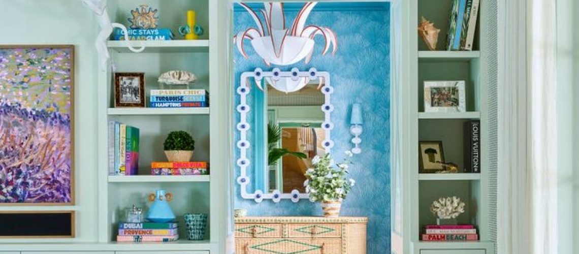
The Psychology of Color in Home Design
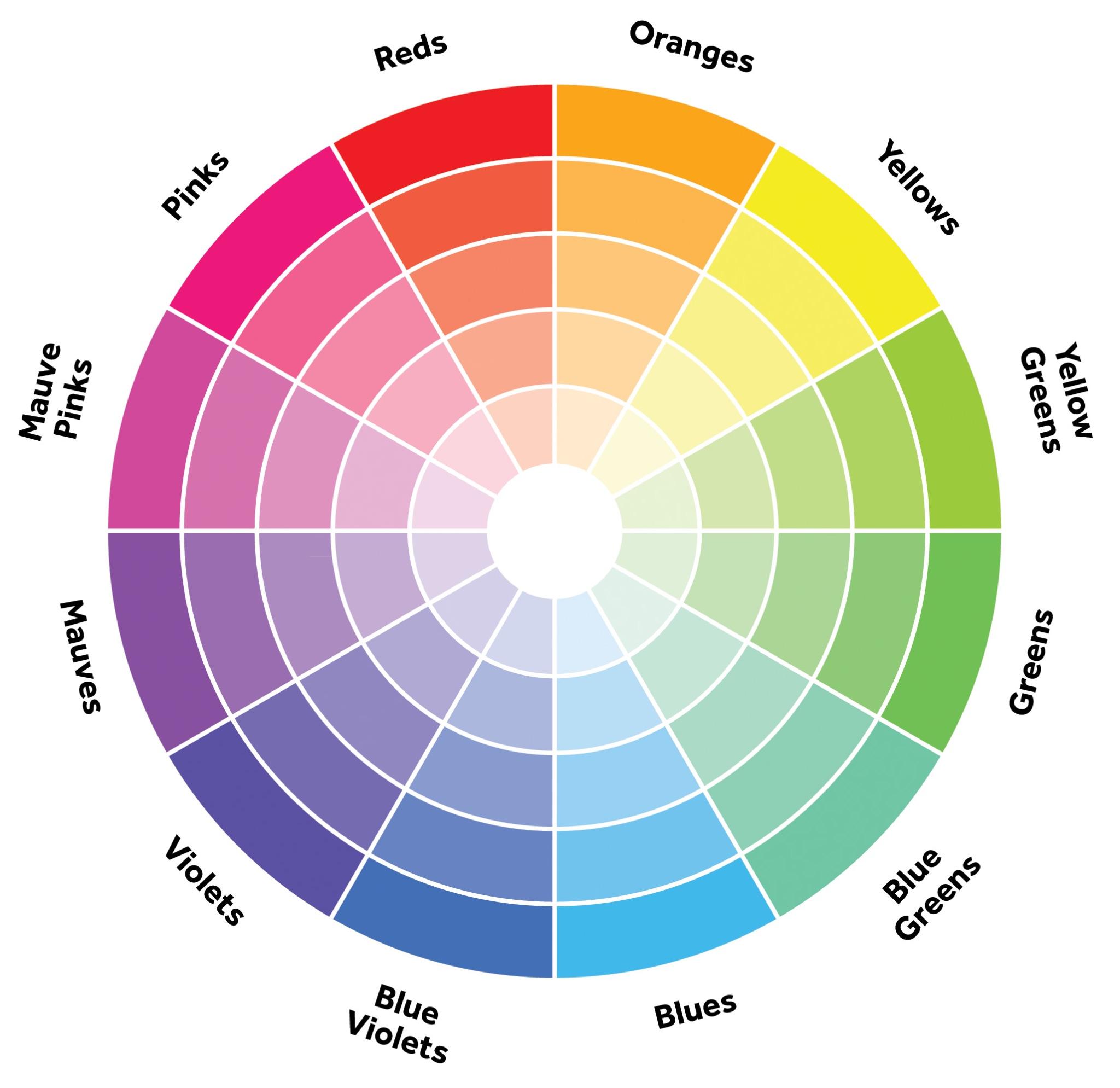
- Warm Colors: Energizing and Inviting
- This includes colors such as red, orange, and yellow.
- Red-Often associated with energy, warmth, and passion. It can stimulate conversation and excitement, which is why it’s popular in social spaces such as dining rooms or living rooms. However, too much red can feel overwhelming, which is why it’s often used as an accent.
- Orange-This vibrant color brings warmth, optimism, and creativity, making it a good fit for areas where you want to feel energized, like a workout space or a playroom. Orange also feels inviting, but it can be intense, so softer or earthier tones are easier on the eyes.
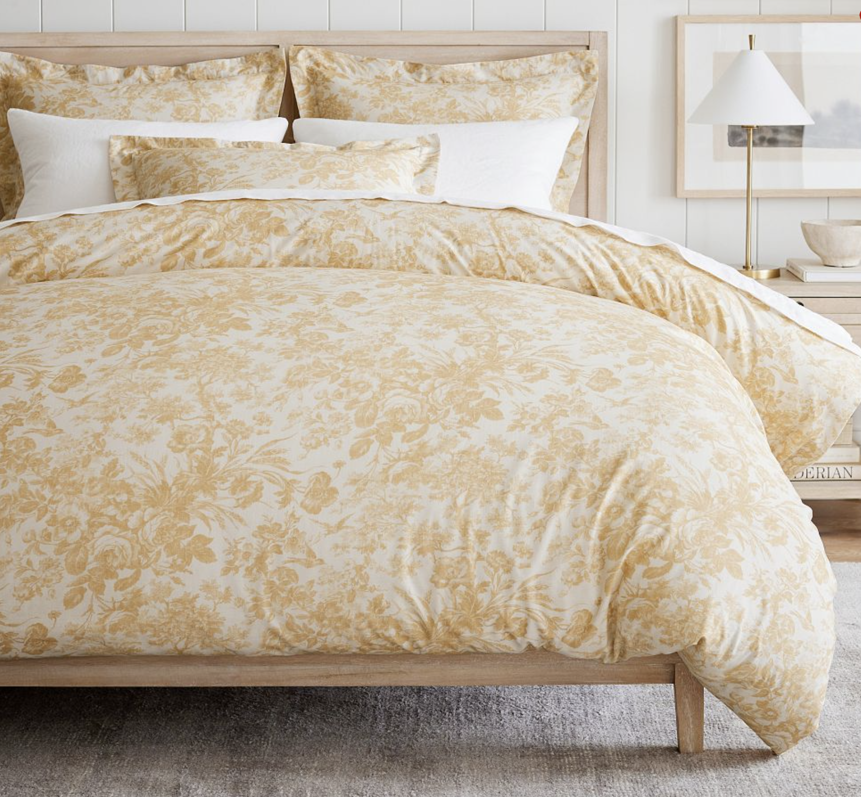
- Yellow-Often seen as cheerful and bright, yellow can add optimism and light to a space. It works well in kitchens or bathrooms, where it creates a fresh and welcoming vibe. Be cautious with the shade, though– bright yellow can be overpowering, while softer yellows are more calming.
These colors can be implemented into home design in many different ways such as…. adding texture, accent pieces, balancing it out with neutrals, and experimenting with different lighting.
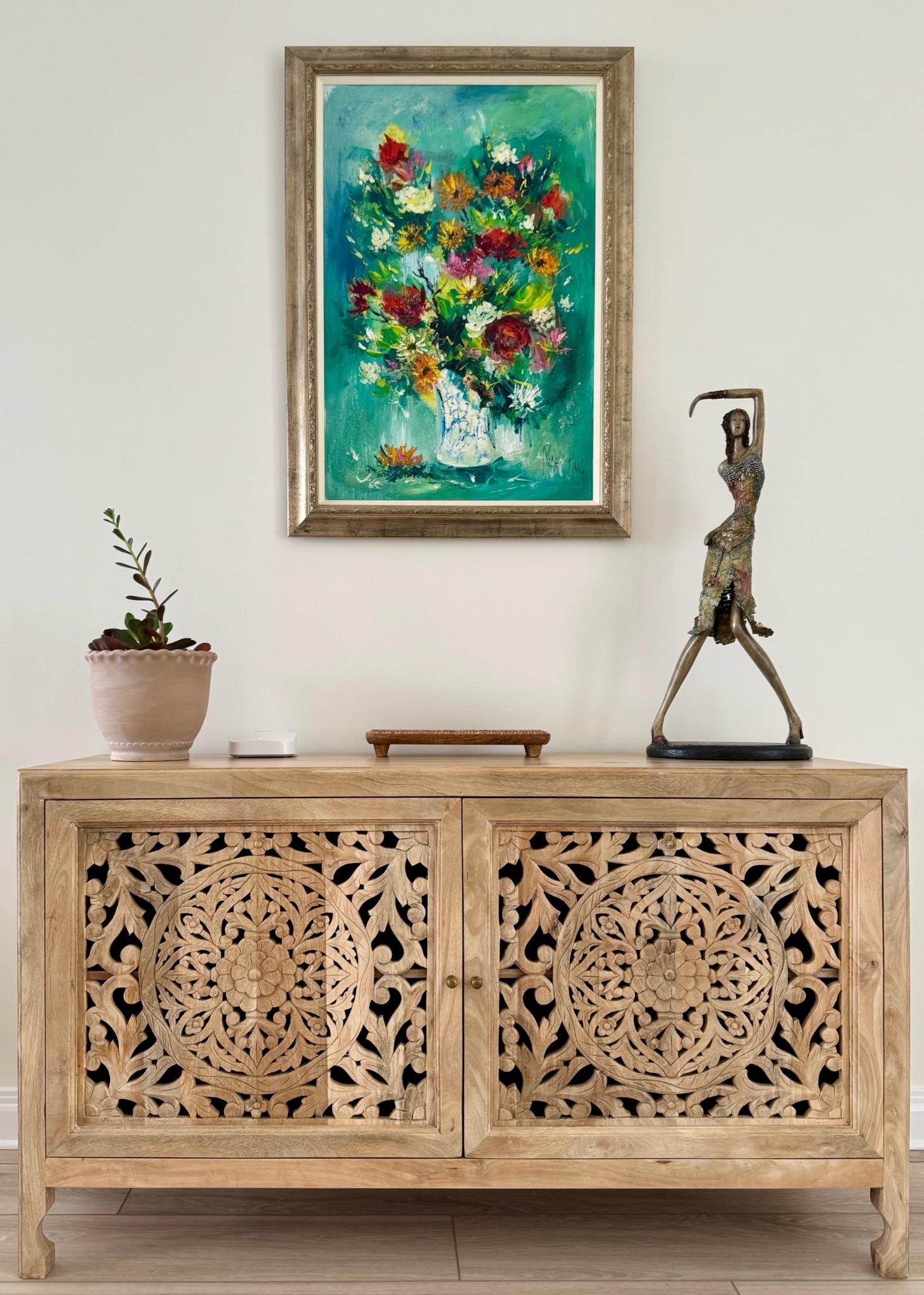
- Cool Colors: Calming and Relaxing
- This includes colors such as blue, green, and purple.
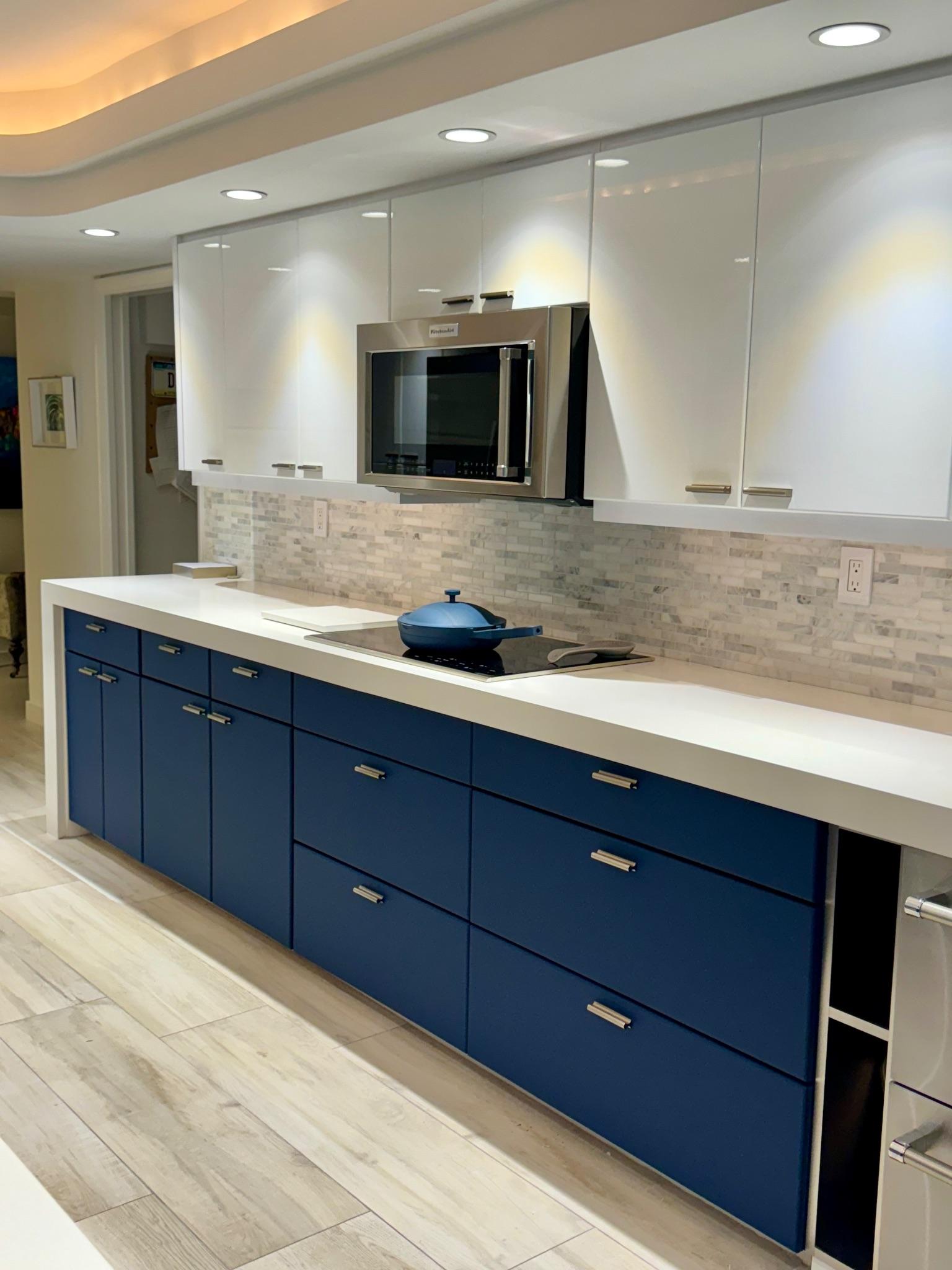
- Blue- This color is known for its peaceful and calming effect, blue is ideal for bathrooms or bedrooms where relaxation is key. Light blues are especially calming, while darker blues can feel more dramatic and sophisticated.
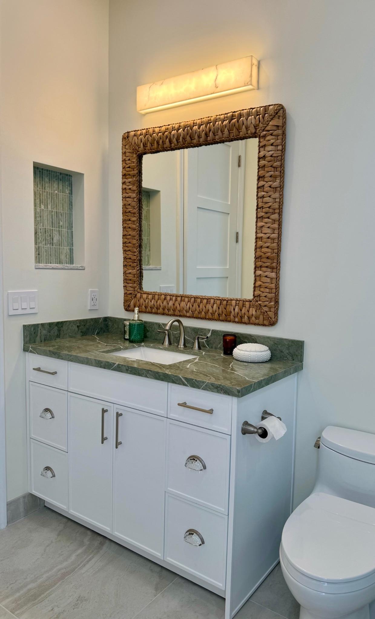
- Green- Representing nature, growth, and balance, green is versatile and adaptable. It’s great for living rooms, bedrooms, and offices as it promotes relaxation without inducing drowsiness. Shades like sage and olive add a grounded, organic feel. Richer greens like emerald add a touch of luxury and pair well with wood tones for a natural, earthy look.
- Purple- This color combines the stability of blue and the energy of red, creating a sense of luxury, creativity, and calm. Light purples like lavender or lilac are ideal for calming spaces such as bedrooms, while deeper purples like plum or eggplant can add drama to living rooms or dining areas.
Different ways to introduce these colors into home renovations would include pairing it with warm accents, layering with texture, optimizing with natural light, and using different shades for more depth to create a more cohesive look.
- Neutral Colors: Timeless and Adaptable
- Although neutral colors aren’t on a traditional color wheel, these colors serve as versatile backdrops in home design. These colors include white, gray, and black.
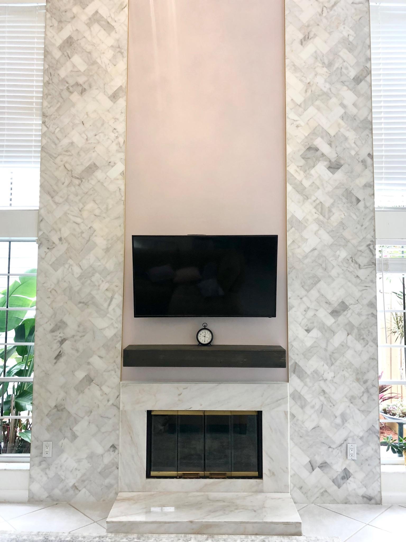
- White- White is associated with purity, openness, and cleanliness. It creates an airy, spacious feeling in a room and reflects natural light beautifully. True white feels bright and modern, while off-whites with warm or cool undertones can add subtlety and prevent starkness. Warm whites work well in cozy spaces, while cooler whites are great for modern, minimalist designs.
- Grey- A balanced and versatile color that evokes sophistication and calm. It can be either warm or cool depending on its undertones, and it’s commonly used in modern and transitional designs. Gray is popular for walls, furniture, and decor. Lighter grays can make small spaces feel larger, while charcoal grays can create a cozy, elegant atmosphere in larger rooms.
- Black- This color conveys elegance, sophistication, and depth. It creates a strong contrast and can bring out the colors and textures in a room. Black is popular for accents, such as trim, furniture, or fixtures, and can add modernity and structure to a space. It’s often used in minimalist, industrial, or contemporary designs.
Neutral colors are timeless and adaptable, providing a flexible canvas that can make a space feel cohesive, relaxing, and elegant.
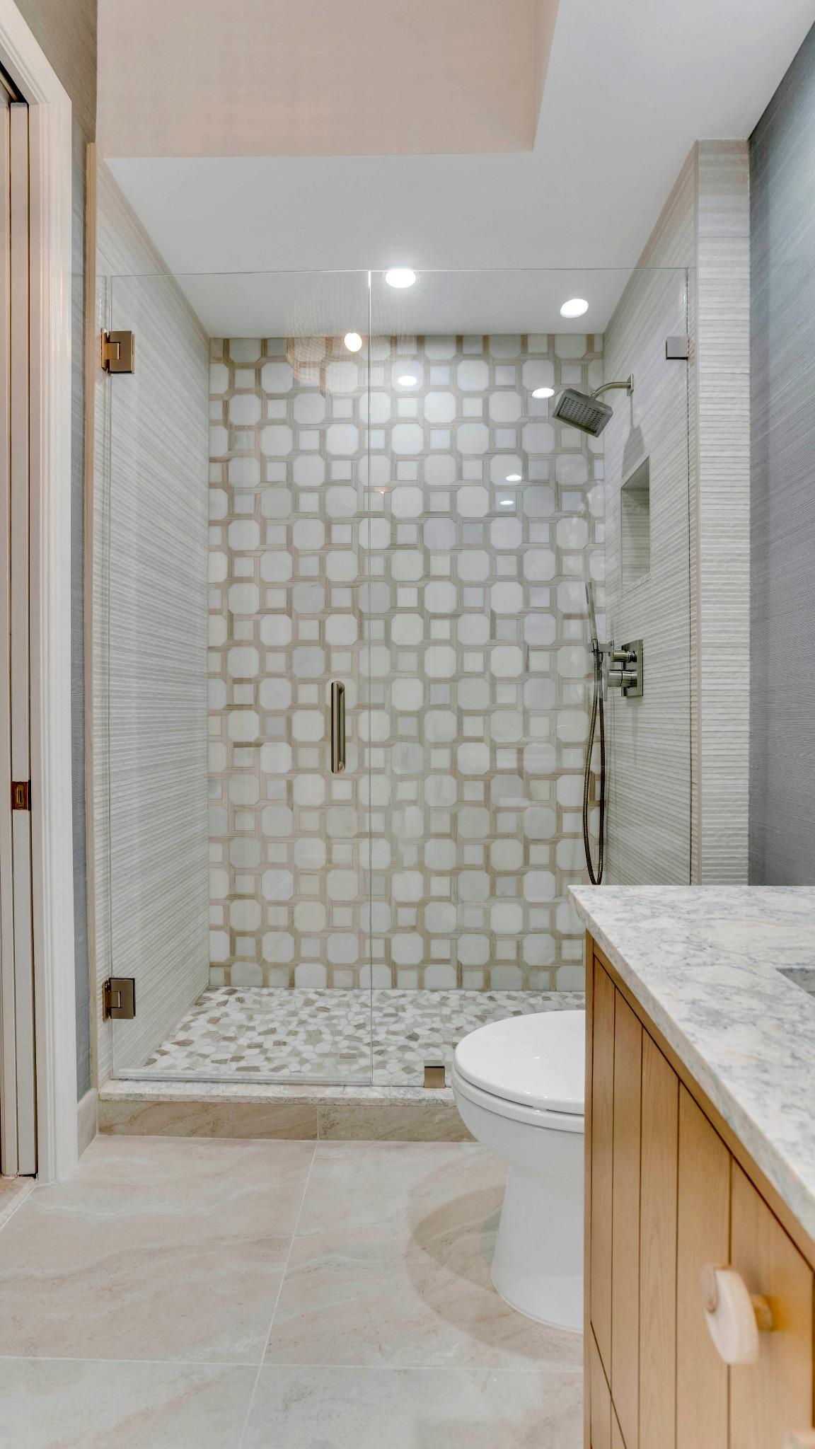
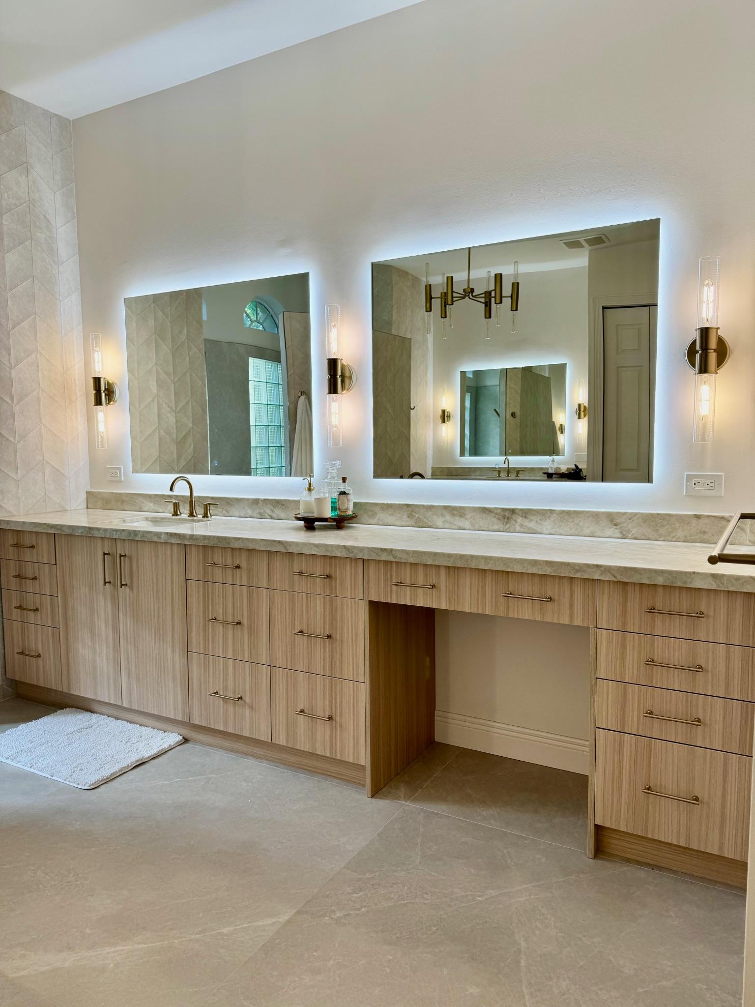
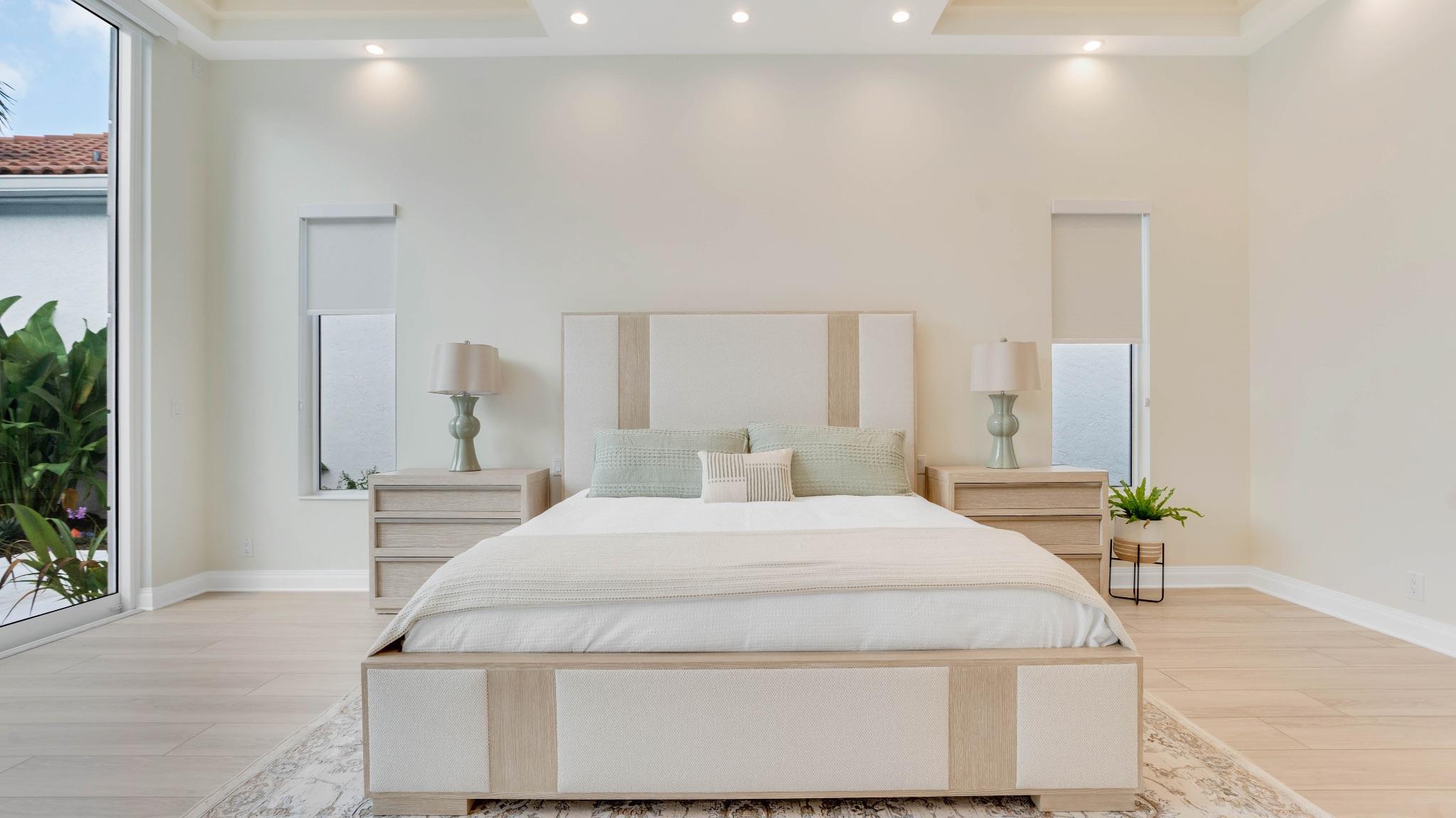
Using color can help you craft the home of your dreams. Each color can be used intentionally for it all to flow together at the end. Depending on your personal style and flare, each home renovation will be crafted to your unique style.
To find out more information about color theory and how to utilize it for any renovations, click this link (our pinterest account) to learn more through our pinterest page. Don’t forget to follow us on our social media, @HomesInnovation, to see our projects, family content, and more.

